1.0
Rymore Wood Lodge is the idyllic highland retreat located deep in the Cairngorms. A secluded homely lodge, completely immersed in the thick Scottish woodland. Equipped with an open fire and wood-burning stove. It’s the perfect tranquil setting for its visitors to unwind, reconnect, and relax in nature.
Moreover, the unique property has become an attractive place to reside. Enticing holidaymakers from all over. The Cairngorms National Park has a variety of holiday-enhancing activities guests can experience. Get lost in the wilderness on one of the many scenic walking trails, biking routes, and even ski slopes.

2.0
Rymore lodge boasts a captivating setting and charming property. Both of which offer a nature enriching retreat to remember. They contacted us to help strengthen their brand image. As well as help to grow as a business. They wanted an eye-catching design that reflected the peace & tranquillity of the Lodge. In other words, they wanted their brand image to be as memorable as their retreat.
3.0
First, we discussed some critical branding questions. What are your brand values? How do you want customers to perceive you? Who is your target audience?
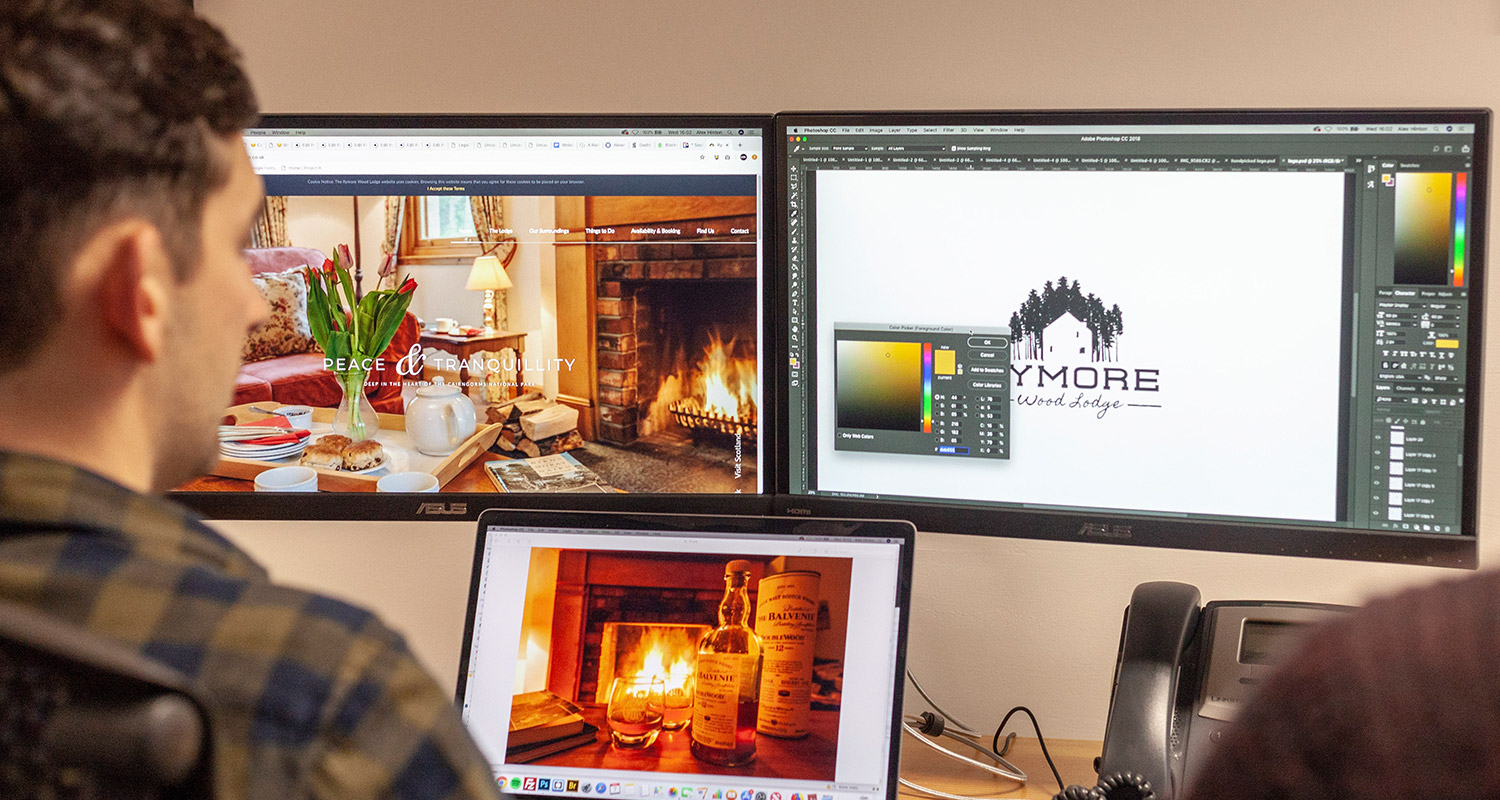
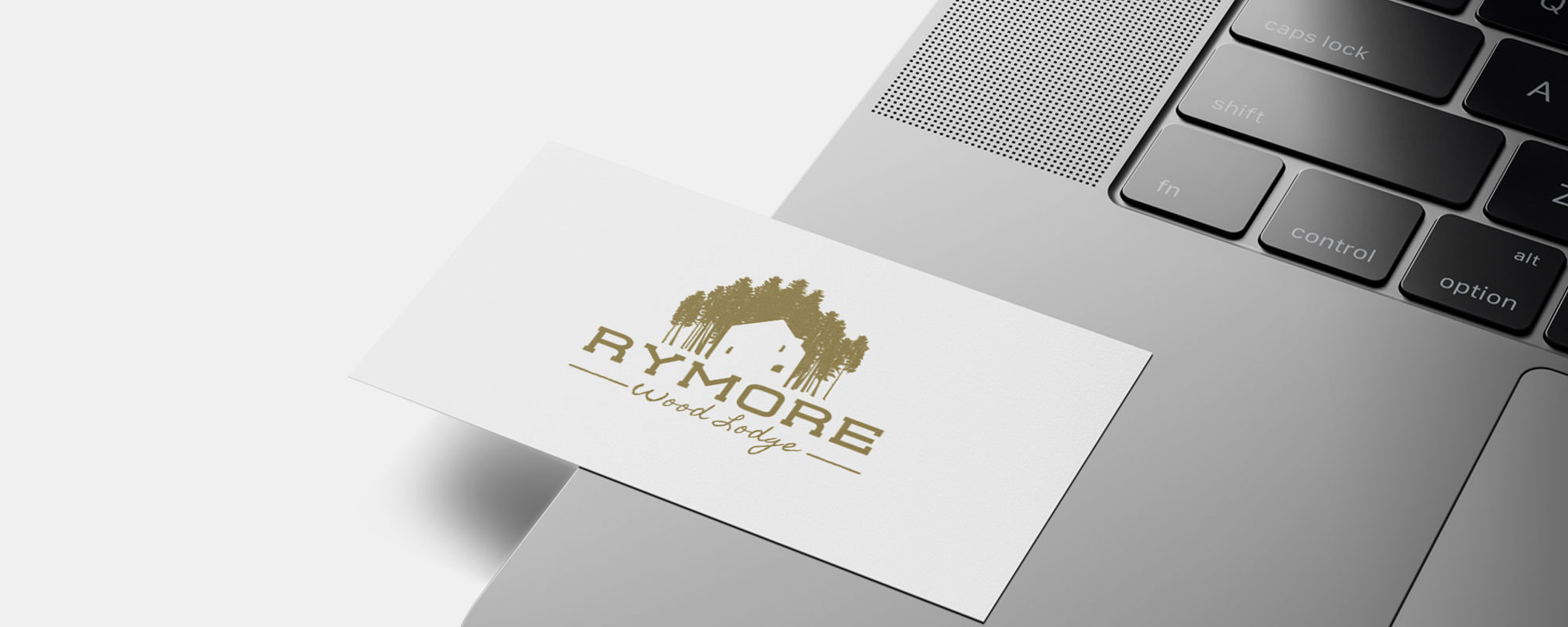
Thereafter, our talented design team got to work. Consequently producing a unique lodge branding that captures Rymore’s beautiful offering. Moreover, showcasing everything they have to offer. In a new logo, stationery and website.

4.0
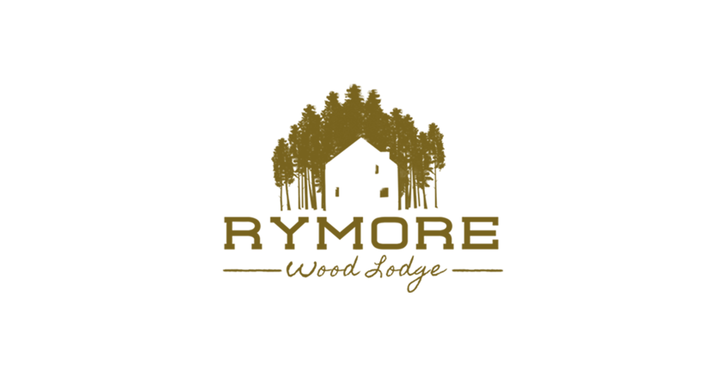
We wanted to incorporate a natural element into the logo. Making it clear to customers exactly what they’re in for. Therefore, we produced an image of a lodge surrounded by pine woodland. The same species of tree surrounding Rymore. Suitably, we positioned the tree to look obscure yet symmetrical. Getting gradually bigger as they follow the shape of the house. In turn, creating a nice all-around logo shape. Despite this, it’s not a perfect triangle of trees. Instead, we made sure it was uneven to reflect the imbalance of nature. The lodge itself is white. Which better stands out against the trees. In addition, there are also a few small windows to emphasise the homely ambience.

5.0
On the contrary, we used two font typefaces. We wrote ‘Rymore’ in a larger bold text to highlight the businesses name. ‘Wood lodge,’ on the other hand, was written in a neat, handwritten font. Handwritten fonts are seen as more fun, friendly and personal. It gives the viewer a sense of personal relationship between them and your business.
The contrast between a large bolder font, and a smaller cursive font makes each one stand out better. ‘Wood lodge’ is telling the customer exactly what they do. Furthermore, we added two more lines side by side of ‘wood lodge. Once again, creating a better shape. Similarly using rustic, sketch-like drawn lines to match the wood lodge typography.
6.0
Rather than using a form of green, which is often used for woodland lodge branding. Instead, we wanted Rymore to stand out in a saturated market. On account of this, we used a rich gold colour. A deeper, rich gold is associated with luxury, prestige and high quality. Further, evoking a sense of a luxury woodland lodge.

7.0
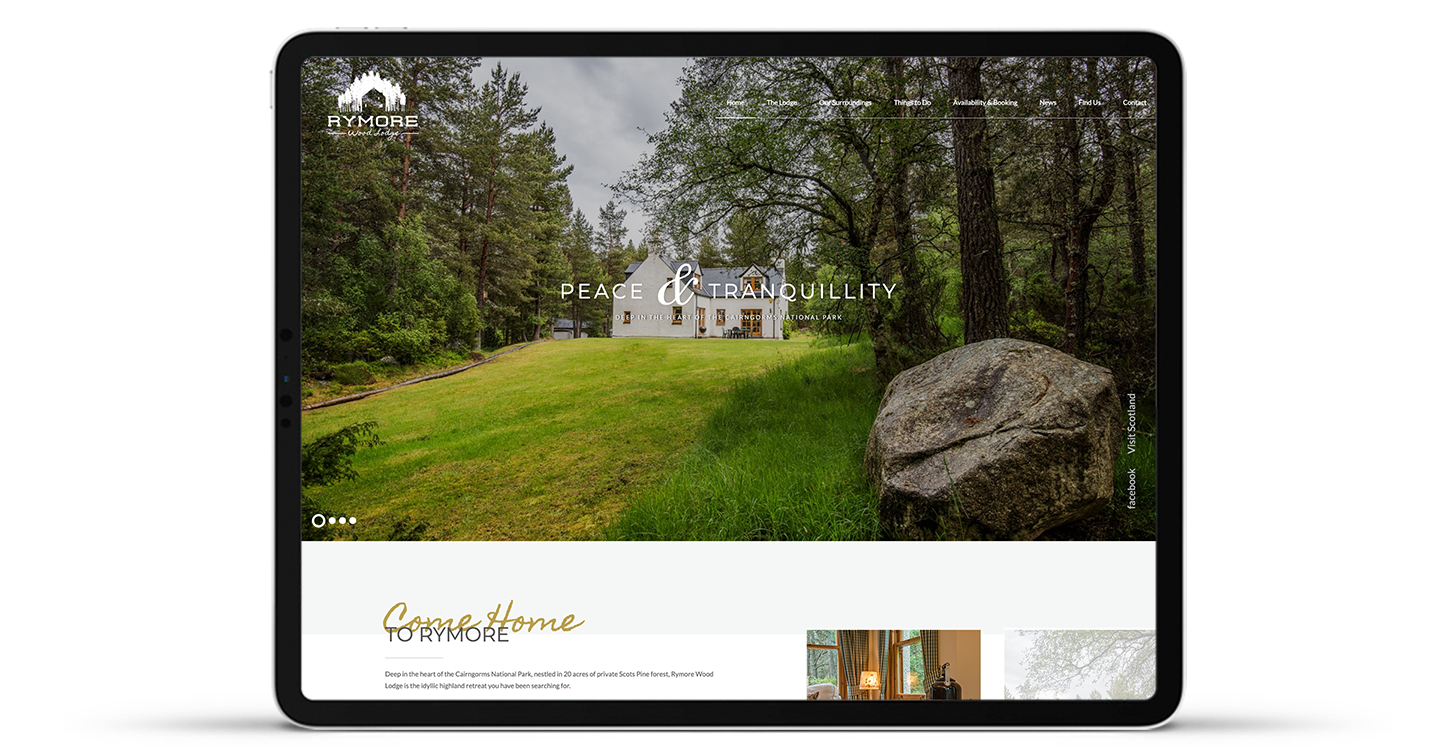
Finally, the website needed to send the same lodge branding message to visitors. Showcasing stunning imagery of Rymores interior, exterior and verdant setting. Therefore, we used the same gold colour scheme and hand-written typography on the site. Consistency in branding strengthens your brand image. On top of this, the website is intuitive and smooth-running. Moreover, supported by an easy to follow navigation bar. Which allows visitors to quickly locate the information they need.
Find out how we can help kickstart your project.