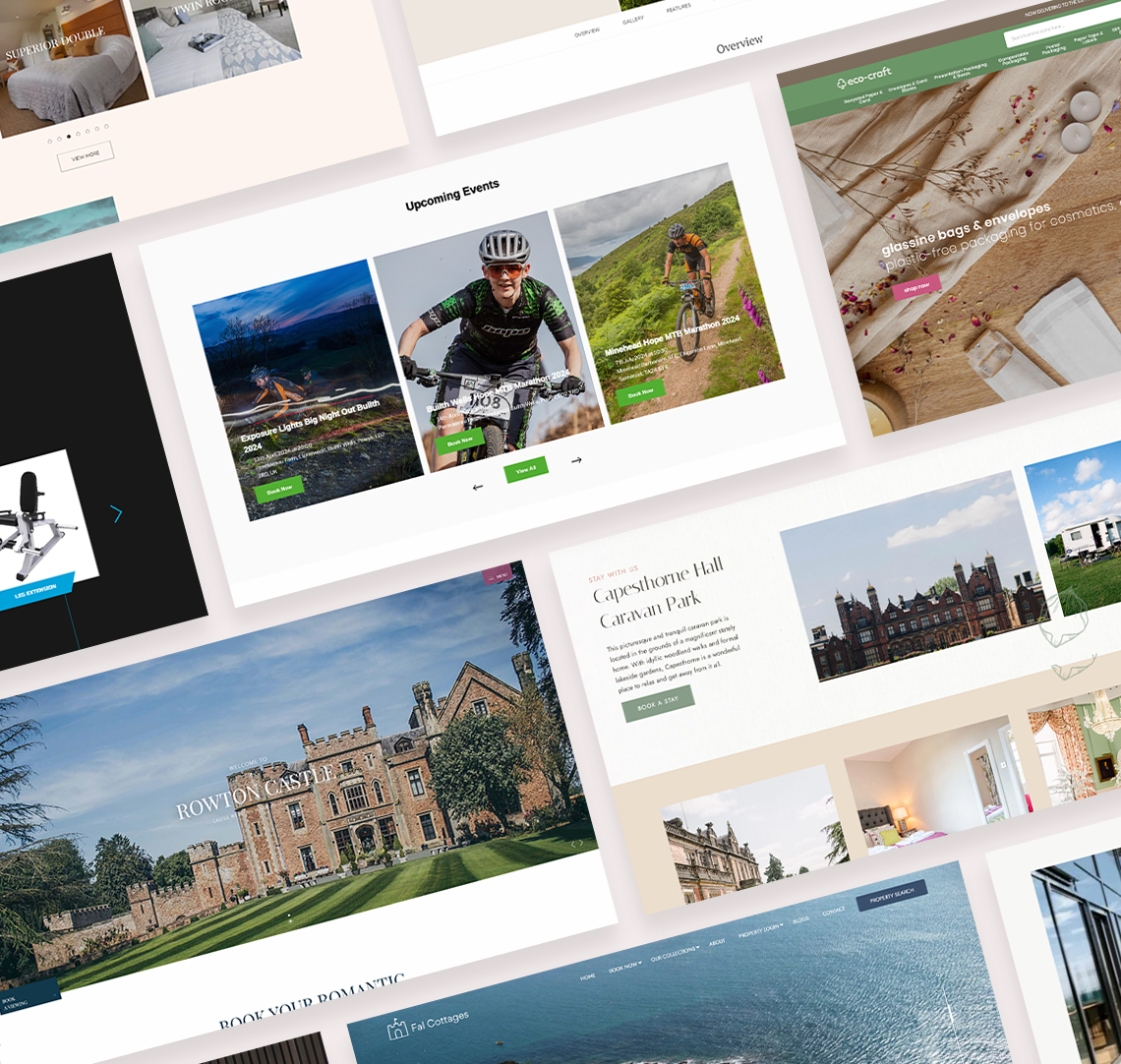
Web Design Trends for 2019
With the continuous evolution of trends and technology, it's an exciting time to be a website owner. Last year saw designers pushing boundaries with innovative ideas and bold aesthetics. Here are the top web design trends for 2019 that will help your website stand out.

Minimalism
Minimalism remains a powerful trend in web design, focusing on reducing elements and content to highlight key focal points. By embracing simplicity, you can create a more effective and engaging user experience.

Micro-Interactions
Micro-interactions enhance user experience by providing feedback and illustrating functionality. They aim to surprise and delight users, making websites feel more human. Expect to see hover effects, scrolling animations, and sound cues becoming more prevalent.

Cinemagraphs
Cinemagraphs, a blend of photography and video, continue to captivate web audiences. These animated GIFs add a dynamic element to web pages, diversifying content and catering to users who prefer visual media. With Google's emphasis on video content in search results, integrating cinemagraphs can boost your SEO.

Natural Shapes
Moving away from rigid grid layouts, natural shapes and smooth lines are becoming more popular. These shapes add depth and contrast, creating a more accessible and comfortable feel. Incorporating subtle motion animation with natural shapes enhances user experience by mimicking real-world movements.

Mobile-Friendly Navigation
With mobile usage surpassing desktop, "thumb-friendly" navigation is essential. Design elements like the hamburger menu are being repositioned for easier access. Josh Clark's "Designing for Touch" highlights the importance of considering thumb movements in mobile design, ensuring a seamless user experience.

Asymmetric Design
Asymmetric layouts break the mould of traditional grid-based designs, offering a fresh and modern look. This approach allows for more creativity and helps your website stand out, portraying a contemporary brand image.

Bold Typography
Bold fonts are becoming a primary design element, often replacing images and videos. The creative use of large, impactful typography draws attention and conveys messages effectively, making your content stand out.

Bright and Vibrant Colour Schemes
The trend of soft tones and monotone palettes is fading, giving way to rich, high-contrast colours. Bright neons, metallics, and vibrant hues bring web pages to life, evoking strong emotional responses. Warmer colours like blue, golden yellow, purple, and green can enhance user engagement.
Discover our bespoke web design services here, designed to keep your digital presence ahead of the game.


