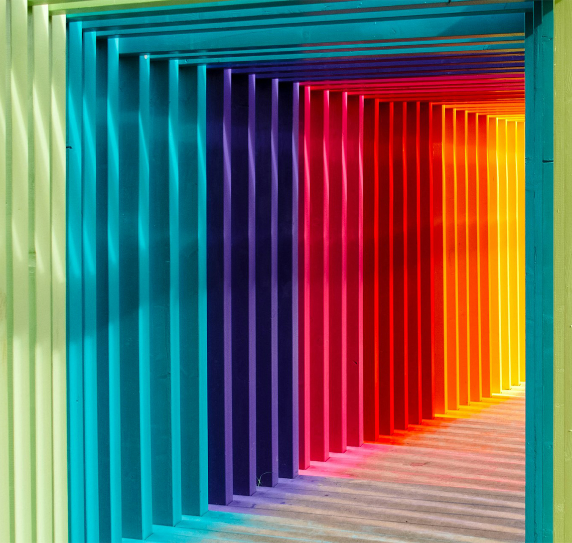
Understanding the psychology of colour in branding
When it comes to branding, first impressions count. A brand that resonates with its target audience consists of more than just a simple logo and icon. Incorporating considered colour psychology to a branding process can have lasting impact on the way a brand is perceived. But what is the psychology of colour in branding and what do the colours represent?

Colour psychology 101
Colour psychology refers to the study of how colours affect human emotions and perceptions. Different colours evoke various reactions, whilst playing a huge role in consumer behaviours and deepening connections. As a digital agency, understanding the significance of the world’s most popular colours is a key element of crafting unforgettable branding, so let’s explore them…

Red
A powerful colour, proven to increase the heartbeat and appetite, red stands as a colour of choice for a variety of fast food outlets. Additionally, the colour’s ability to intensify and accelerate our actions makes it a popular choice in sports and sales branding.
Positive associations: Power, passion, energy
Negative associations: Anger, danger, warning

Orange
Similarly to red, orange draws the eye almost immediately. However, orange associates more with creativity and warmth, given its similarity to the sun.
Positive associations: Courage, confidence, warmth
Negative associations: Frustration, immaturity, ignorance

Black
A shade highly favoured by formal, high end brands looking to convey a sense of sophistication. Black remains timeless, as well as a symbol of power.
Positive associations: Elegance, authority, power
Negative associations: Oppression, coldness, heaviness

White
A symbol of purity and minimalism, white is often used to evoke feelings of peace, freshness and calmness. When companies need branding that personifies “less is more”, white is the shad of choice.
Positive associations: Purity, cleanliness, simplistic
Negative associations: Sterile, empty, plain

Pink
Often associated with femininity and softness, brands with a focus on women and beauty products are known to gravitate towards the colour. Evoking feelings of youthfulness and passion.
Positive associations: Imaginative, creative, feminine
Negative associations: Excess, decadence, suppression

Green
For brands emphasising with health and the environment, green’s links to growth and sustainability make it a popular choice. In simple terms, green represents life.
Positive associations: Health, hope, freshness
Negative associations: Boredom, stagnation, envy

Yellow
Like orange and red, yellow’s strong hue commands attention. Associated closely with energy, optimism and happiness, it should be used sparingly as not to overwhelm consumers.
Positive associations: Innovation, intellect, warmth
Negative associations: Irrationality, anxiety, caution

Purple
Drawing associations from royalty, purple conveys a strong sense of luxury, sophistication and elegance. An alternative to black for brands looking to create a high end identity.
Positive associations: Wisdom, wealth, sophistication
Negative associations: Excess, decadence, moodiness

Wrapping up...
Without doubt, the importance of colour use cannot be understated. If your branding isn't resonating with your intended audience, get in touch with us today to transform your identity.


